
Discover how to design your menu to sell the most profitable dishes using menu engineering, real data, and CRM strategies.
The most repeated recommendation about restaurant menus remains the most incomplete: make it look pretty. That helps, but it does not decide on its own which dishes sell or which ones leave a profit. In Mexico, the menu that actually drives margins is designed around popularity, margin, and operational complexity, not aesthetics, because a dish can sell well and still strain the kitchen if it uses unique ingredients, generates waste, or takes too long to come out.
Why a pretty menu does not guarantee profitable dishes
An attractive menu can organize perception, but it does not correct a poorly thought-out recipe. In a Mexico City coffee shop, for example, a highly photogenic panini might appear profitable and end up driving waste if the cheese, proteins, and sauces are not shared with other products. In a casual restaurant in Puebla, something similar happens with dishes that become dining room "favorites" but consume specific ingredients that do not rotate in another section of the kitchen.
Real profitability lives in the operation
Traditional menu engineering already starts from that logic. First, a representative period is chosen, usually a month, and a single menu family. Then, units sold per dish are calculated to measure popularity, the margin is estimated as price minus food cost, and each dish is classified using a popularity threshold that is typically set at 0.70 × 1/number of dishes in the family, according to the methodology described in the technical guide to menu engineering for Mexican restaurants (revistarestaurantes.com).
Rule of thumb: if a dish is popular but complicates the production line, it is not helping the menu. It is taking up space.
The most expensive mistake is treating each recipe as if only its gross margin mattered. In the kitchen, it also matters whether it shares bases with other dishes, reduces waste, and is executed quickly. That is why a profitable menu does not start in Photoshop; it starts in the workflow.
For those who want to delve deeper into the tactical approach, it is worth exploring the Artgonuts blog and reviewing how the relationship between the menu, operation, and sales is brought to life in a real restaurant.
Diagnosing your menu with real sales and margin data
A serious diagnosis is not done "by eye." It is done with POS data, updated recipe costing, and a clean reading of sales per dish. The technical guide for Mexico recommends focusing on the 8 to 10 best-selling dishes, calculating their food cost using POS and costing data, and treating any dish that sells fewer than 5 units per week or has a food cost exceeding 40% as a candidate for elimination (focorentabilismo.com).
How to read a menu without fooling yourself
First, a representative period is selected. Then, the menu is separated by family, because mixing breakfasts with dinners or drinks with main courses distorts the analysis. The margin is calculated for each dish, and it is placed within a simple popularity logic. This cut is what allows deciding whether a product should stay, be modified, or go.
A dish is not kept because "it has always been there." It is kept because it sells, leaves a margin, and does not disrupt the operation.
In high-volume businesses, such as gas stations with food courts in Nuevo León or coffee shops in the State of Mexico, this filter serves to clear the menu of products that distract the team. It also helps concentrate commercial communication on what already proves real demand. If the counter is full but the margin is not moving, the problem is rarely the number of customers. It is usually the sales mix.
Operational logic also requires looking at the unique ingredient. If a dish depends on an ingredient that does not appear anywhere else on the menu, that dish costs more than it seems. The same gastronomy profitability guide recommends eliminating it if it also sells poorly (panca.pe).
Criterion | Recommended threshold | Suggested decision |
|---|---|---|
Weekly sales | Fewer than 5 units | Review for elimination |
Food cost | Over 40% | Raise price, reformulate, or remove |
Popularity | Low within its family | Rewrite, move, or promote |
Unique ingredient | Yes | Simplify or remove from the menu |
To establish the correct costing for each recipe, it is useful to consult how to calculate the cost of a dish and cross-reference that number with real cash register rotation.
Menu architecture and the ideal number of options per category
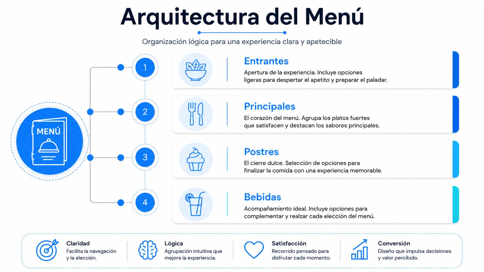
The menu sells better when the customer quickly understands what they are looking at. A logical structure by categories—starters, mains, desserts, and drinks—reduces friction and guides reading without forcing everything to be compared against everything else. The internal order should place what you want to highlight first, not the cheapest or the most obvious.
Fewer options, faster decisions
A profitable menu does not try to sell everything. A source specialized in menu design recommends limiting options to 20–25 dishes to prevent customers from forgetting the first options as they read on (yoempresa.org). The same logic suggests working with 4–5 options per category in drinks and 6 to 8 in cocktails, because too much variety complicates selection and slows down the operation.
In a coffee shop in the State of Mexico, this helps ensure that breakfast does not turn into an endless catalog. If the business depends on that time slot, it is also useful to review a guide like the most popular breakfasts in coffee shops to decide which categories deserve more space and which ones are just taking up inventory. In a beach restaurant in Yucatán, simplification also improves server speed and line consistency. In both cases, the menu works as a service tool that facilitates the ordering process.
Useful practice: if a category requires a long explanation for the customer to understand it, it probably has too many options.
For high-traffic formats, like a car wash with a snack bar in Baja California, a short menu reduces decision time and avoids overwhelming the eyes. The customer is not looking to read more; they are looking to make a better decision. And when the menu is overloaded, the kitchen feels it too.
Another hospitality technical guide recommends organizing categories logically and avoiding sorting by price, because that drives unnecessary comparisons and makes the cost more visible than the value (cocidodigital.es). This logic is useful in services where speed of choice matters as much as the average ticket. It also helps in businesses with digital menus and in dining rooms where the team needs the menu to reduce questions, not multiply them.
Visual placement and descriptions that push star dishes
The location of a dish on the menu changes its probability of being chosen. The most profitable products should live in the upper or central part of each section, or in the so-called golden triangle, where the eyes land first. It is also useful to highlight them with a box, photo, or recommended label, but with moderation and criteria.

Where to look first and what to put there
On digital menus, the rule changes slightly. The practical recommendation is to highlight no more than two dishes per section, because too many highlights compete with each other and dilute the hierarchical effect (enlacocina.telemesa.es). It also helps to avoid a price column aligned to the right, because that invites direct cost comparisons instead of reading value.
In a coffee shop in Nuevo León, this logic helps push better-margin drinks without the need for discounts. In a barbershop with premium drinks in Baja California, the menu can work as a small impulse catalog, as long as the profitable option remains visible and well-described.
Commercial rule: if the price is seen before the name, the menu has lost part of its persuasive power.
Brief descriptions help more than they seem. It is not about embellishing, but about reducing mental friction and increasing perceived value. A dish with a precise name, clear texture, and a well-written sensory reference usually sells better than a dry list of ingredients. The same logic applies to coffee shops, breakfasts, and high-rotation products.
Another useful technique is the anchor effect. Placing a high price within a family makes the others seem more reasonable, and this works best when the anchor dish also makes operational sense, not when it is just there to impress. In the end, the menu should not look expensive or cheap; it should look clear.
Digital menus, A/B testing, and CRM segmentation
When the menu leaves paper and moves to a digital environment, the game changes. It is no longer just about visual design, but about click probability, reading by location, and the ability to test variations without reprinting. In restaurants and coffee shops in Mexico City and Monterrey, this change allows personalizing the menu by channel, time of day, or dining area without stopping the operation.
Testing before scaling
The right question is no longer just which dish looks better, but which version moves the sales mix. A digital menu allows A/B testing by time slot, location, or customer segment. It also lets you measure if the redesign affected the average ticket or the repeat rate, something a physical menu can hardly show clearly.
The value appears when that data is connected to a CRM. A platform like Swirvle centralizes customers, segments by consumption habits and location, and allows executing campaigns via WhatsApp, email, or notifications to measure the impact of each promotion on sales and return. In a business with loyalty and a digital menu, the menu stops being a static piece and becomes a measurable asset.
What actually works: launching a version of the menu, measuring by segment, and adjusting without assuming the first proposal was the correct one.
Digitalization also opens up space for menus editable by location. This is valuable in businesses where a star product changes depending on the profile of the area or the time of day. One location can push breakfasts, another can prioritize snacks, and another can sell high-margin drinks better. Without this segmentation, you end up offering the same thing to different audiences.
Further on, measurement gains precision if it is cross-referenced with purchasing habits, frequency, and visit type. The CRM provides that reading, and the menu stops depending on intuition or isolated design. To understand this data layer, it is useful to review what a CRM system is and then integrate it into the menu analysis.
30-day plan to redesign your menu and measure results
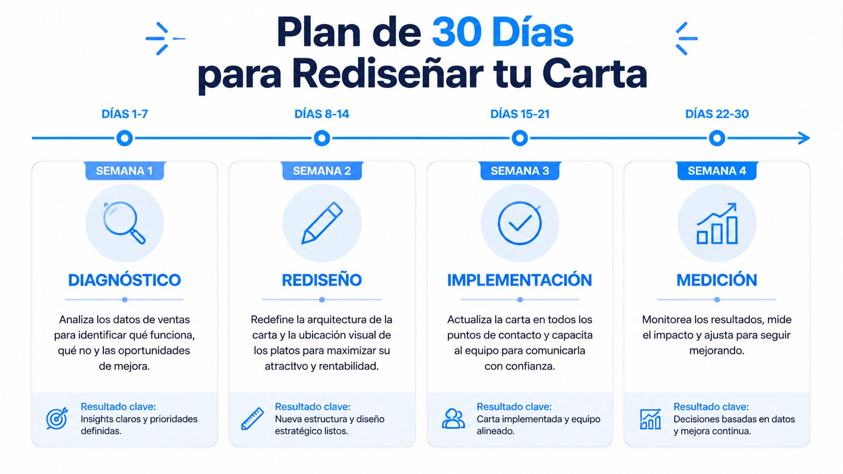
A useful redesign is not solved in an afternoon. It is organized by weeks and validated with the cash register, kitchen, and dining room. In the first week, sales, recipe costing, and execution times are gathered. In the second, the architecture is reorganized, deciding what goes on top, what is highlighted, and what is eliminated. In the third, the physical and digital menus are published. In the fourth, you measure whether the average ticket, sales by category, and repeat business changed.
Four weeks, a single goal
In a Mexico City coffee shop, this plan can start with the best-selling breakfast and continue with the sides that yield the highest margin. In a casual restaurant in Puebla, the focus can be on simplifying complex dishes that slow down the line and improving descriptions for those that are actually profitable. In food businesses in Yucatán, the priority is usually to organize the menu so the kitchen can execute faster without losing commercial clarity.
Standardization also matters. Recipes must have exact quantities and the calculation must consider waste and yield factor, using the formula net quantity / yield factor = gross quantity. This discipline prevents the menu from promising a profitability that the kitchen cannot sustain in actual service.
Operational conclusion: if an improvement is not measured in sales, margin, and repeat business, it remains just an opinion.
The ultimate goal is not to have a prettier menu. It is to have a menu that pushes the right dishes, lowers friction in the dining room, and gives the kitchen a cleaner path. When the menu is designed with data, implemented by channel, and measured by segment, the redesign stops being a visual change and becomes a profit generator.
Swirvle helps connect the menu with customers, locations, and campaigns to measure which dishes promote best and which segments respond most. If the business wants to move from a menu that just looks good to one that actually sells, it is worth visiting Swirvle and reviewing how to centralize sales, loyalty, and segmentation into a single operational flow.
Related Blogs

Oct 22, 2026
How to prevent employee petty theft in my business?

Oct 21, 2026
How to Control Food Waste in a Restaurant: 2026 Guide

Oct 20, 2026
What is the global invoice for the general public and when is it issued? SAT Guide

Oct 19, 2026
How to take restaurant orders on WhatsApp without losing any?

Oct 18, 2026
How to Create a WhatsApp Business Catalog to Sell More: 2026 Guide

Oct 17, 2026
How to set up quick replies in WhatsApp Business?